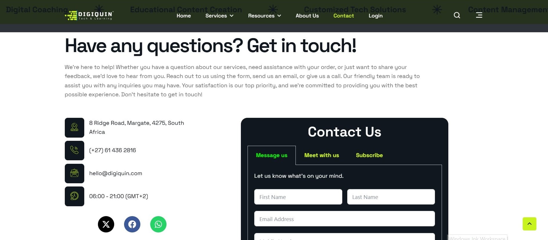
DigiQuin Website


About The Project
Our Website, Built Like Our Work: Smart, Simple, Effective
This is our home online — and we built it ourselves, from the ground up.
More than just a site to show off our services, digiquin.com is a fully working example of how we approach digital design: clean, clear, and created with real people in mind. It’s both a portfolio piece and a practical tool — something that looks good and works hard in the background.
We didn’t just want something pretty.
We wanted something purposeful.
🧩 Built With Intention
Every page, button, and click has a reason.
Prospective clients can browse through what we offer with zero confusion.
Returning customers can book a session, drop us a WhatsApp, or get answers without digging around.
Curious visitors can follow our journey, read our blog, or sign up for updates with ease.
The design is modern, but it doesn’t shout.
The layout is simple, but never boring.
The vibe? Professional, friendly, no-nonsense.
📱 Mobile-First & Human-Focused
We know people aren’t only browsing on laptops anymore — so mobile responsiveness was baked in from the beginning.
The site works everywhere, looks good on any screen, and still delivers the same smooth experience whether you’re on your phone, tablet, or desktop.
💬 Tech That Actually Helps
We didn’t just plug in tools to look “techy.” We added features that make life easier:
💬 WhatsApp Integration – Instant contact, no forms needed
📆 Calendar Booking – Book a time without back-and-forth emails
💳 Secure Payments – No hassle, just click and pay
📧 Email Signup – Stay connected without chasing people down
It’s fast, functional, and user-first — just how we like our digital spaces.
🛠 Constantly Evolving
This website isn’t “done.” It’s a living project.
We tweak, improve, and upgrade it constantly, keeping it aligned with our own growth and what we learn working with clients.
It reflects our values:
✅ Make things work better
✅ Keep things easy to use
✅ Build tech that supports humans — not the other way around
Project info


