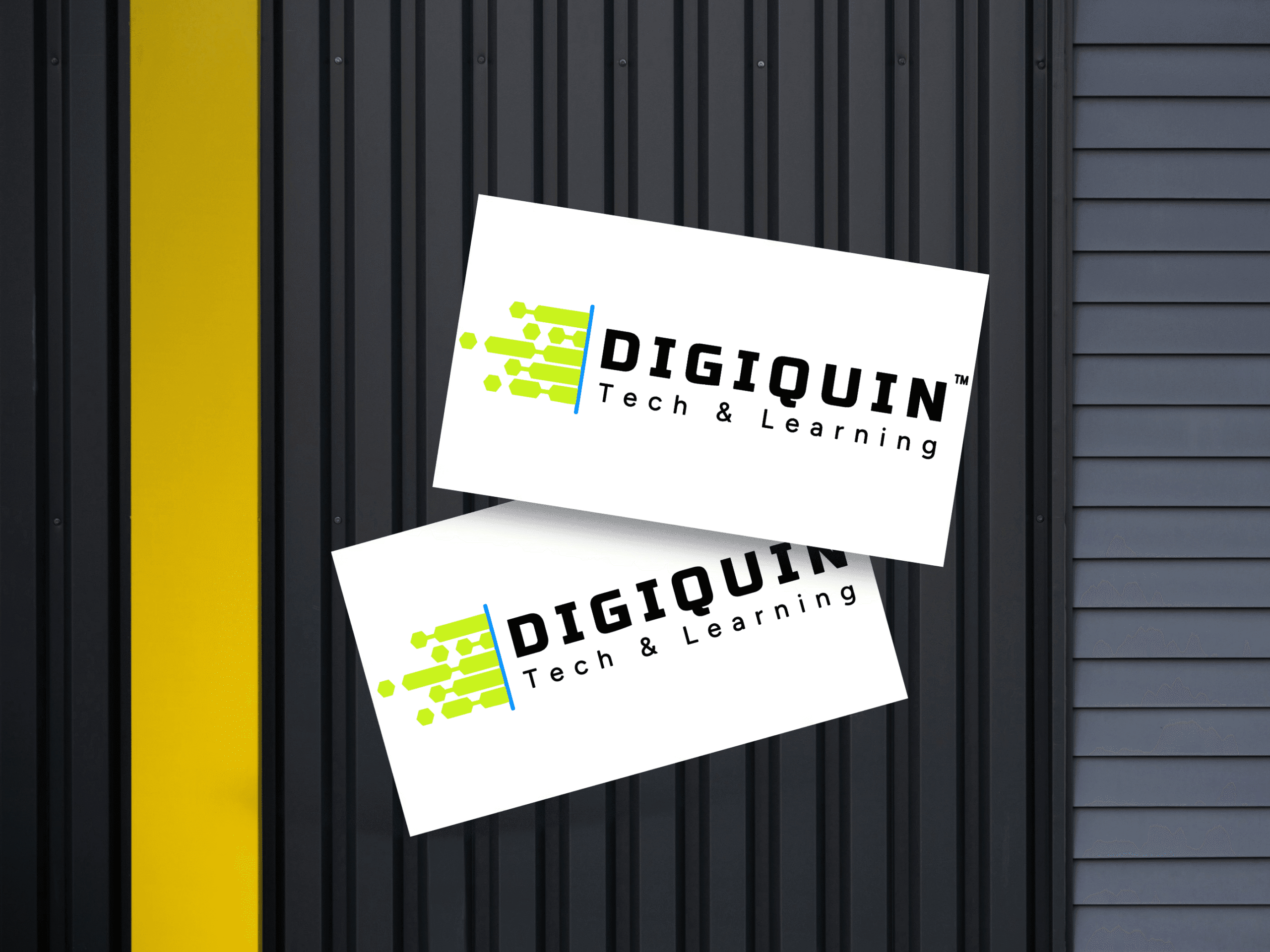
DigiQuin Logo Design


About The Project
Designing Clarity, One Hexagon at a Time
This one’s personal — it’s the official logo for DigiQuin, our own brand and business.
At DigiQuin, we partner with people to untangle their digital chaos. Whether it's tools, tech, automation, or systems — we help make things work better together. So, when it came time to design our own visual identity, we wanted it to reflect exactly what we do:
👉 Bring structure and flow to messy digital worlds.
🔶 The Concept
The design is simple, but meaningful.
We used a hexagon shape as the core building block — a symbol often associated with structure, efficiency, and interlocking systems (think beehives, code grids, and chemistry). But we didn’t stop at one.
On the left side, you’ll see scattered hexagons — representing disconnected tools, scattered processes, or general digital overwhelm.
As you move right, the hexagons fall into clean alignment — showing the transition to systems that work together with purpose and clarity. It’s our job visualized: taking something messy, and turning it into something manageable.
🎨 The Look & Feel
We went with a sharp black for the name — clear, legible, and professional. It anchors the brand in trust. There is a white text version for black backgrounds.
Then we introduced a vibrant lime green accent. It’s modern, tech-forward, and energetic — without being too loud. The green also adds warmth to the sharpness, making the brand feel approachable and human, not just technical.
Together, the colors strike a balance between confidence and friendliness — exactly how we want people to feel when they work with us.
💻 Built to Scale (Literally)
The logo had to look great everywhere:
On websites, apps, business cards
Inside docs and slides
As a favicon or a profile icon
Even printed on physical assets in the future
So we made sure it’s clean, minimal, and flexible. No unnecessary fluff. Just a visual identity that gets out of the way — and lets the work shine.
💬 What It Says About Us
This logo is more than just a mark. It captures the way we work:
We simplify the tech, not complicate it.
We organize tools, not just recommend them.
We don’t throw fancy stuff at you — we make what you already have work better.
We’re proud of this one. It feels like us.
Whether you’re looking at it on a WhatsApp message, a service page, or the footer of a proposal — this logo stands for smart digital support that doesn’t make life harder.

