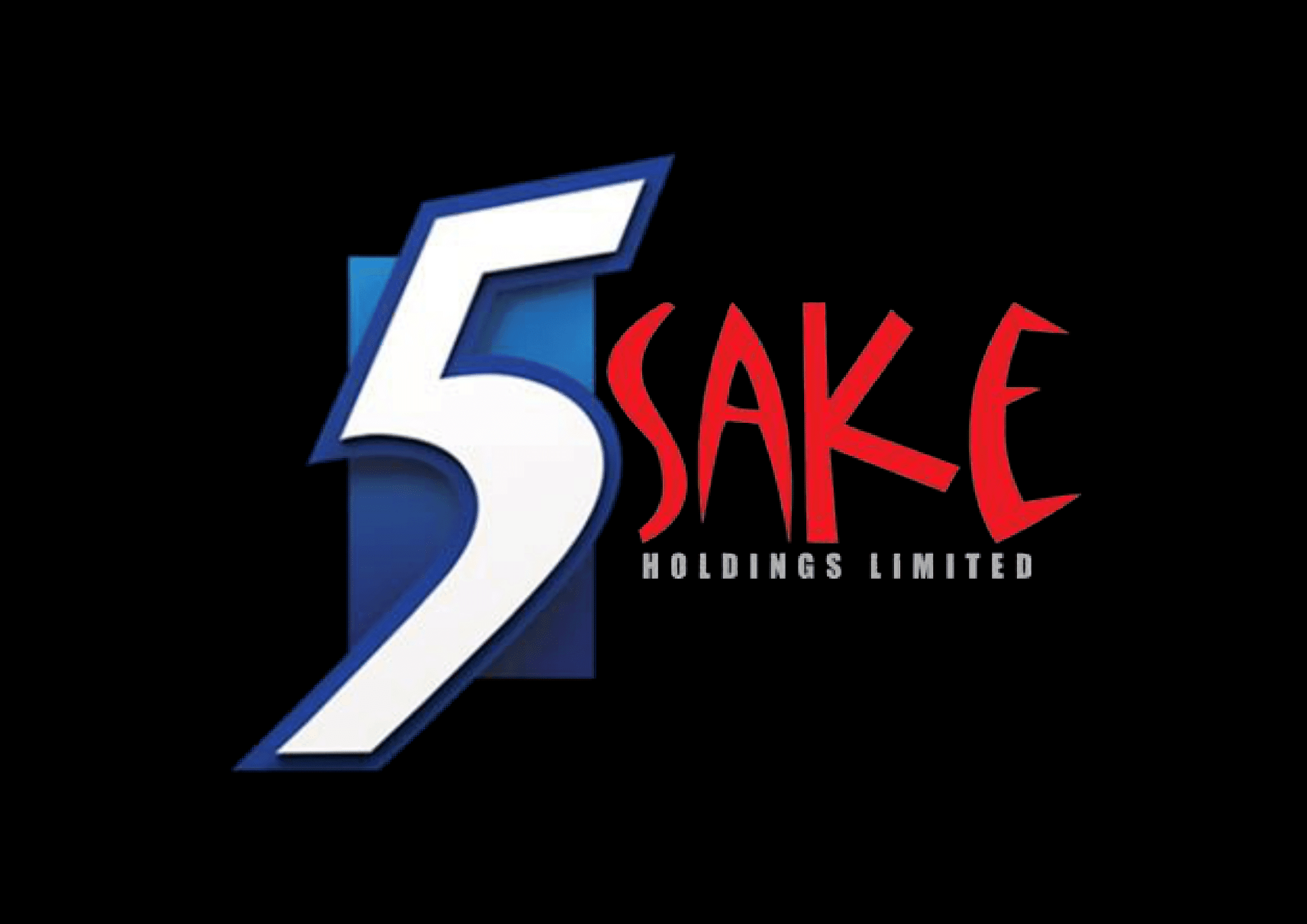
5Sake Logo Design


About The Project
5Sake Holdings needed a logo that didn’t whisper. It had to speak clearly—with confidence, energy, and purpose. A consulting brand with strategic roots, it demanded a visual identity that feels bold yet intelligent, modern yet timeless.
🧭 Design Philosophy
The driving idea behind this project was clarity with edge. We set out to build a logo that could serve as both a visual anchor and a directional compass—a symbol of the company's structured yet adaptable approach to problem-solving.
This wasn’t a flat emblem. It was designed to move, breathe, and lead conversations.
🔢 Iconic “5” Meets Motion
The oversized, stylized “5” leans forward with purpose. It’s not just a number—it’s a statement of motion, of progress. Designed with dynamic curves and clean edges, it brings a feeling of momentum and sharp execution.
The slight gradient backdrop adds dimension, creating visual depth without clutter. It quietly supports the “5” without stealing the spotlight—just like a good strategy.
🔴 Typographic Personality
“Sake” bursts forward in a bold, expressive red—each letter uniquely styled and energetic, breaking from the expected. It’s where logic meets creativity, and that’s the core of 5Sake’s brand promise: Strategic with spark.
The subtitle “Holdings Limited” brings the balance—structured, precise, and deliberately understated to let the top line shine.
🎯 Brand Psychology & Versatility
Color choices were intentional:
Deep blues signal professionalism, reliability, and a cool head in high-pressure environments.
Red injects vitality, urgency, and boldness—because strategy shouldn’t be boring.
Built to scale: Whether on a business card, pitch deck, or the side of a building, this logo holds its ground and earns attention.
This design delivers more than aesthetics. It’s a strategic identity system—engineered to support and elevate 5Sake’s brand presence in any scenario.
Because in consulting, what you say matters—but how you show up? That says everything.

