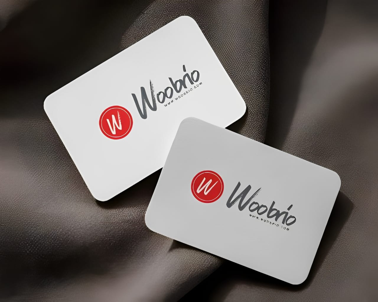
Woobrio Logo Design


About The Project
Welcome to the world of Woobrio – a brand that dares to blend technology, innovation, and design minimalism in one bold stroke. This logo design project was all about capturing clarity with character and ensuring every detail echoed the brand's future-facing ethos.
💡 The Vision
Woobrio approached us with a need for a clean, modern, and distinctly digital identity—something that could confidently sit across apps, websites, presentations, and packaging without losing its edge.
Our goal?
To design a logo that’s instantly recognizable, stylishly simple, and purposefully professional.
✨ The Design Approach
Bold Simplicity:
The primary “W” mark stands loud and proud in a vivid, energetic red circle. Its hand-drawn texture brings human energy into the tech space, giving the logo a creative spark without chaos.Striking Contrast:
Juxtaposed against the brushstroke “W” is the brand name in a soft charcoal script – confident, calm, and balanced. This contrast between raw and refined creates a visually memorable identity.Minimal but Memorable:
No gimmicks. No clutter. Just a design that knows who it is and who it speaks to.
🔍 Versatility in Focus
Every great logo must scale with confidence – from favicon to billboard. So we ensured:
Crisp visibility on both light and dark backgrounds.
Strong visual clarity even at small sizes.
Balanced proportions for use in print, digital, and merchandise.
🔗 Built for Brand Consistency
The final logo functions beautifully across platforms:
Profile icons ✅
App splash screens ✅
Business cards & letterheads ✅
Marketing & social media graphics ✅
It becomes more than just a symbol – it becomes a signature.
Whether it’s on a startup’s pitch deck or the corner of a clean website interface, the Woobrio logo stands ready to represent innovation with personality.
This project proves that sometimes the simplest visuals say the most – clean, strong, iconic.

